Would it be polite?

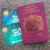
On the checkout page of the Lazy Bee Scripts web site, there’s a drop-down list that allows the customer to select their title.  It’s a very short list.  I think the record for choice of titles was held by a Canadian web site with over a hundred, but I can’t find that one, so I’ll have to make do with citing Fortnum and Mason which (when I last checked) listed 56 options.  (They anticipate more orders from military officers, bishops and nobility than we do).  Our list has just seven options.  I’m thinking of scrapping it, or replacing it with just one.  Aside from the gender-neutral options (Dr, Prof, Rev), there is one male honorific and three female: Mrs, Miss and Ms.  One of the reasons for scrapping it is the number of instances in which we end up addressing men with the title Ms.  This happens because a small number of men seem to assume that the default title is (or should be) the male one, whereas Ms is our default because, by a small margin, when we first set the list, most of our customers were female.

We offer Mrs and Miss because some women find Ms clumsy and artificial – but then all titles are artificial.  Aside from signifiers of earned rank (Doctor, Brigadier, etc.), titles are a social construct; a polite form of address.  They are an artefact of a language and society.  Some languages do without them (my friend suggested Norwegian as an example), some rely on patronymics for polite formality.  English has co-opted Master and Mistress, originally polite acknowledgements of authority, and then corrupted the latter by turning it into a designator of marital status, whilst not adopting the same path for the male component.  (Some weeks ago, when I was discussing this subject, I came across Sara Wheeler talking about this on Radio 4’s ‘A Point of View’.  Well worth a listen, particularly if you want a little more of the history.)

UKXSpaceI am of the view that not only is it unnecessary to use a form of address that includes marital status, but also that for most forms of communication gender is completely irrelevant.  But what should one do instead?  I am so old that I find the polite form deeply ingrained.  The problem with ditching all titles – which is otherwise a good option – is that it loses the distinction between politeness and familiarity.    As it is, I can distinguish between formal enquiries and snake-oil salesmen who are trying to pose as my best mate.  I would prefer to have the option of a polite form of address.  The friend with whom I was discussing this preferred M, others already use Mx.  I’m afraid that those irritate me.  I think it’s the way they stand for something without that something being explicit.  I would prefer to co-opt a word that is already in use.  “Comrade” carries too much baggage (Tovarisch).  “Friend” would be inappropriate in some circumstances (a court summons, for example).  My favoured option is Citizen.  It’s a bit long-winded (three syllables), but it conveys a polite address to someone with a shared participation in society.  (Arguably, it is weighed-down by the French Revolution, but these days most of us aren’t particularly troubled by that.)  One objection to Citizen is that, technically, British people are not citizens; in a monarchy we are subjects.  (I object to being a subject.)  One cannot address a customer as Subject.  I looked-up synonyms for Citizen, hoping for something better.  The results were mildly depressing: subject, national, native, taxpayer, voter.  The best (but most ridiculous) was cosmopolite.

So, do you mind if I call you Citizen?

The Language of Protest

Divided by a common language – Part 3

I recently noticed another case of American English creeping into a British news report.  Somebody (I forget who) was protesting something (I forget what).  That’s American.  In British English, we would protest about something.  Occasionally, we protest against something and sometimes we protest to somebody.  (“There are potholes in my street; I’m going to protest to the local council.”)  That’s a useful example because it shows that protest is used in slightly different senses and therefore the preposition performs a useful function in distinguishing a general airing of a grievance from a directed criticism.  (Are American protests always (and only) public demonstrations of opposition?  If so, the preposition is redundant, but they can’t protest to City Hall, they can only complain.)

Similarly, American English uses write without the preposition:

“Why don’t you write me,
I’m out in the jungle
I’m hungry to hear you”

Paul Simon (on the Bridge Over Troubled Water album)

Again, British English preserves the distinction between writing to someone and writing about them.   American English also writes about its subjects, so instead of two different prepositions, the distinction is made by using the verb with and without the preposition.

Now we should consider paying a visit.  I have aunts in England and in Michigan.  I visit the English branch frequently, but if I could go to see their American sister, I would visit with her. To my English ears, that is a very strange construction.  Consider the phrase “when I visit Detroit, I visit with my aunt”.  In American English, that means that when I go to Detroit, I go to see my aunt.  In British English, it means that when I go to Detroit, I take my aunt along.  We could, for example visit the Detroit Institute of Arts.  I don’t think American English would visit with the museum, so the preposition with seems to be used to distinguish between visiting people and visiting places.  That isn’t wrong (it’s the way that form of English works), but, to me, it seems unnecessary since I can usually tell the difference.

Section of Diego M Rivera’s Detroit Industry fresco, foyer of the Detriot Institute of Arts
(Click image to visit!)


For more on prepositions, see Free Chairs for Stage Directions

For more on the differences between British and American English see Where Do You Go Shopping? and Formal or Informal Dress?

A Passport for the Pub?

Discussion of “domestic vaccination passports” (some form of portable proof of vaccination against Covid-19 to enable the bearer to access venues or services) seems to throw up two counter-arguments. For some, there is a libertarian argument that there should be no restriction on access to anything.  For others, a civil liberties argument that a vaccination passport will exclude marginalised groups in society who do not have access to vaccination.  There is something to be said for both of those positions, but to assess them, we need to think about the uses (and limitations) of a vaccination passport.

At the time of writing, there is still a lockdown in the UK.  I can do essential shopping, I can do limited outdoor exercise, but otherwise my liberties are curtailed.  I cannot go to a pub, a restaurant or a theatre.  As my flowing mane will testify, I cannot get a (professional) haircut.  If I need to access medical services, I am first quizzed about Covid symptoms.  Since an unvaccinated person can still access essential services, my assumption is that the purpose of a passport is to allow a vaccinated person to access non-essential services.

This is about risk management.  I see it as being particularly important for large gatherings (theatres, for example) and personal services (hairdressers).  The libertarian argument is that anyone should be free to choose where they go.  The passport does not stop you exercising that choice (unless you have chosen to remain unvaccinated); what it does is to give you more information about the choice you are making.  Without a vaccination passport system, you have no information about the Covid risk posed by visiting a venue with strangers.  With the passport, you have more information, you can make a more informed choice.  Choice is a good thing (libertarians argue); surely informed choice is even better.

Thinking of it from the point of view of a venue or organisation providing entertainment, theatres want to maximise their audiences.  A policy requiring vaccination would offer a level of reassurance to potential audience members that a visit to the theatre represents a minimal level of risk, since everyone else there will have the same level of Covid immunity; it would therefore tend to encourage larger audiences.  But how does the theatre know someone has been vaccinated?  That’s the passport.

I imagine that the entertainment sector would make greatest use of vaccination passports: I don’t want to catch Covid but I desperately want to go to the theatre (and I want shows to be sustainable, and that means big audiences).  With large-scale entertainment, the choice is limited: a theatre is putting on a show; you see a show or you don’t.  At the other end of the scale we have small venues, with more consumer choice: pubs.  Here the libertarian argument might be applicable.  A pub can choose to operate a vaccination policy or not.  If it operates the rule, you only get in with a passport.  The next pub down the street chooses not to operate the policy, and anyone can go.  If you have a passport, you have a choice of pubs; if you don’t, then the choice is likely to be smaller.

The civil liberties argument is more wide-ranging, expressing the desire to avoid excluding groups who are already marginalised.  So who would a vaccine passport system exclude?  At the moment, the biggest category would be people who intend to be vaccinated, but have not been vaccinated yet.  I’m in that category, and I accept that I will (and should) be excluded from some activities until I have had the jab.  (But when I’ve had it, I want to access society as fast as possible.)  Secondly, we have people at the margins of society – particularly the homeless.  As long as the passport is not used to exclude people from essential services, I would suggest that this not an argument for not implementing passports, instead it is an argument to making sure we deploy vaccination to marginalised people.  (The blunt economic argument here is that the passport is only of benefit to people who can afford to access public entertainment, but it is not itself an impediment to people who cannot afford to do so.)  I would make the same argument in the third category, which is groups (particularly ethnic minorities) amongst whom vaccine take-up is slow.  We need to vaccinate those people (and encourage them to go to the theatre).  The fourth category is people who oppose vaccination.  That’s fine.  They can make a rational choice to accept a level of risk.  What they cannot do is to impose that risk on me.  A vaccine passport would exclude them from some venues and activities, but that is a consequence of their own choice.

All this isn’t perfect.  The most likely implementation is likely to be a smartphone app.  I occasionally take a pair of elderly relatives to concerts.  Neither has a smartphone.  Some provision has to be made for such people.  There is, as yet, no firm plan to vaccinate children (at the time of writing, early trials are happening).  The passport system needs to find a way through that issue.  Nevertheless, I see domestic vaccination passports as part of the fast track back to normality.

Free chairs for stage directions

This is going to be a rant about stage directions and seats, but I may take a while to get there because there are inconvenient corpses to dispose of, a siding of anomalous trains, and my dislike of the word preposition.

Verbs, nouns and adjectives are all defined by what they do – their grammatical function.  Prepositions seem to be defined by where they go: they are positioned in front of an object.  That, in itself, doesn’t tell me what they do.  “They’re words that go in front of other words” isn’t much help, and it makes prepositions sound trivial.  They’re not.  In English in particular, prepositions do a lot of heavy lifting.

Having spent the entirety of my schooldays not studying Latin, I have recently dipped a toe into the language and found that Latin prepositions are comparative lightweights.  Take the Latin word “in” for example.  As a preposition, it tells you something about the relationship between the subject and the object that it preposes.  Something, but not a lot.  “In aqua” tells you that something is in the water, but “in aquam” tells you that something is going into the water.  The preposition is the same, but here the case of the noun is doing the work to tell you the difference between the static state of being in the water and the dynamic plunge.  Furthermore, the Romans thought that tables were like water: they would say “in aqua” to mean in the water, and “in mensa” to mean on the table.  In Latin, the preposition tells you nothing about the nature of the object, whereas English prepositions not only tell you about the difference between a static relationship (in) and a dynamic one (into), but they also tell you something about the object, whether it is a container (in) or a surface (on).  (In case you are wondering about water being a container, it is a container of fish and inconvenient corpses.)

There are some exceptions to the English use of “in” with a container and “on” with a surface.  The ones that spring readily to mind concern public transport: I’m on the train.  Why do we say that?  If you want to specify the compartment of a train, you are in a carriage or in the buffet, never on, but we treat the complete entity of locomotive and carriages as a surface.  I wonder if this is some sort of historical hangover from treating a means of land transportation as if it were a flat-bed cart (or a series of carts – a baggage train).  That sort of origin is more likely with the evolution of road transport from wagon to bus.  Less clear with the railways.  A better idea might be the analogy with shipping, where one gets on board the ship because one steps onto the deck.  (I suppose that’s true of busses as well, since they have single or double decks.)   Anyway, I digress.

In most circumstances, “on” is used with surfaces.  It doesn’t matter what the object is, as long as it behaves as a surface: you can have a book on the table or a picture on the wall.  If you say “in the wall”, you are either referring to building fabric (another brick, or a hole) or it’s a very thick wall, and we’re back to the disposal of inconvenient corpses.

All of which brings me to chairs and some of the oddities that we have found whilst editing stage directions.  You can sit on a chair, and you can sit in a chair, but they are different kinds of chairs.  Some chairs are surfaces, some, generally softer and more comfortable ones, are containers.  If a stage direction says that Mabel is sitting in a chair, the reader will recognise that the chair is a container and therefore probably imagine some sort of armchair.  If Mabel is in a kitchen, sitting in a chair, the reader will wonder why there is an armchair in a kitchen.  It is much more likely that Mabel is sitting on a kitchen chair.  Similarly, nobody ever sat in a bar stool.  You can save yourself work by letting the preposition do its job in the imagination of the reader, but if that creates an anomaly (and Mabel really is sitting in an armchair in the kitchen), then you need to add words to clarify.

On or in?

If you enjoyed this rant about stage directions and chairs, there is more joy for you in The Problem Of Bums on Seats.

If you came for the chairs, but stayed for the prepositions, then may I suggest ‘Why Can’t the English Teach Their Railways How to Speak‘?

A Pair o’ Dactyls

A dactyl is a metric foot made up of a stressed syllable followed by two unstressed.  Put two dactyls together and you get the diddly-diddly rhythm of a jig in 6:8 time.  Hence:-

A Pair o’ Dactyls

©2020 by Stuart Ardern

Click-clacking, rat-a-tat,
rhythmical jaw-snapping,
filling the air with their
primitive cries
Noisily squabbling,
avian ancestors,
leather-winged dinosaurs
take to the skies.


Image from Dinoguy2 from Wikimedia Commons

Taking a Butcher’s at Fonts

Fonts are fun.  When we (Lazy Bee Scripts) publish a stage play or pantomime, we pick a title font that says something about the content.  Usually it’s a feeling conveyed by the typeface (from chilling to frivolous); occasionally it’s suggested by the font name – so I have used a font named Gaslight for plays set in the late Victorian era.

So far, so good.  However, we distribute a lot of scripts as Word files and that brings some additional problems.  Obviously we don’t expect our customers to have the same fonts installed on their computers as we do, but Word provides a means of embedding TrueType fonts into the Word file, so that they are available to readers of that file who don’t have the font installed.  There are two options for doing this: embed the whole font file or only characters used in the file (which Word recommends as “best for reducing file size”).  We take the latter option.

When the customer opens the file, if they don’t have the font installed, they may see a message about restricted fonts.  Sometimes we use fonts that (for copyright reasons) are not freely distributable, however, if embedded, they will show up on-screen and may be printed.  What the customer can’t do is to edit a document containing a restricted font.  That’s fine.  Most of our customers do not need to edit our scripts.  (Not least because of the general point that you should not change a copyrighted work without the permission of the copyright holder.)  However, there are occasionally good reasons for editing (embedding lighting cues for a specific production, for example).  In that case, if the customer saves an editable version, they will lose the embedded font and Word will substitute its default system font (which probably won’t look anything like our chosen font).

The next problem was pointed out to us by author Tim Cole when we sent him a copy of his script Butchers.  When he took a butcher’s *, he pointed out that there was a spurious square at the end of the title.

Usually, spurious squares are an indication that the creator of a font has not implemented some characters (usually punctuation marks).  In this case, the square appeared at the end of the line, in the position of the paragraph return.  Even more bizarrely, making the paragraph marks visible displayed the pilcrow (the printers’ end of paragraph mark, ¶ ) in the chosen font.  Somehow, when the pilcrow was supposed to be invisible, Word was trying to display a character that wasn’t in the embedded character set.

If you paid close attention to my second paragraph, you may have identified the obvious way around the problem: instead of embedding just the used characters, why not embed the whole font?  You’re right.  I tried that, and indeed the invisible character that isn’t embedded in the “used characters” is part of the whole font set and so if the whole font set is embedded, the problem disappears.  Unfortunately, there’s a cost to doing that.  Remember that recommendation from Microsoft that embedding just the used characters is “best for reducing file size”.  Embedding a whole font in a test document grew it from 98 kB to over 1.7 MB – so one invisible character cost me 1.6 MB of storage space.  The problem is prevalent in all non-installed fonts and, since we don’t know what our customers have installed on their computers, applying the fix to all scripts would cost us 10 GB of on-line storage.  (You can argue that this is not very much by modern standards; however Lazy Bee Scripts is a small publisher with small storage requirements compared to, say, YouTube.)

I found a different solution, which was to replace every return character in a script title with a return in the document’s default font.  Quite tricky to automate (and, because of thousands of scripts, it needed to be automated), but it removes the spurious square at no cost to the file size.
All this may well be a feature of the latest version of Word.  I had not come across it before, but then I don’t keep archived copies of different versions of Word just to test for Microsoft’s problems.


*     “Butcher’s hook”, rhyming slang for look.  Not many people see butcher’s hooks any more, but they were very useful to my grandfather.

The Third Most Evil Woman

Charlotte de La Trémoille painting hanging in the Blickling Estate

In the middle of editing Ben Alexander’s play The Siege of Manchester I took a holiday and accidentally came across this picture on a visit to the National Trust’s Blickling Estate in Norfolk.  The woman in question is Charlotte de La Trémoille, the wife of James Stanley, the Seventh Earl of Derby.  Ben’s play has more to say about her husband (who was the besieger of the title) and, whilst Charlotte appears as a character, the play does not cover the later events that earned her this epithet.  (Ben mentions it as an aside in his production notes.)

The description was a gift from the Parliamentarians in the English Civil War, against whom she commanded a company of marksmen in defence of Lathom House.  She refused to surrender and held out in the last bastion of Lancashire Royalists until the seige was broken by Prince Rupert.  One assumes that the champions of parliamentary democracy took a dislike to strong, independent women (although they were more polite to Mary Bankes after her defence of Corfe Castle).

So, if Charlotte de La Trémoille is third, who outranked her in evil?  Second place went to her contemporary, Henrietta Maria, Queen Consort of King Charles I.  She was considered to be interfering politically and swaying her husband in the direction of Catholicism – so both an enemy of parliament and an enemy of Protestantism.  And first place?  Eve.

We’re back to Genesis, chapter three for that one.  In the King James version, God’s interrogation of Adam runs:-

… Hast thou eaten of the tree, whereof I commanded thee that thou shouldest not eat?

And the man said, The woman whom though gavest to be with me, she game me of the tree, and I did eat.

So Adam, failing to admit to his own agency, blames Eve.  The Parliamentarians seem to have taken this view without thinking about it.  Never mind that Adam had a choice and could have applied his own judgement.  Never mind that Eve was tricked.  He was clearly right to blame her.  It was her fault.  She is evil.

This way of thinking has a long and unglamorous history.  In some – many – quarters, it persists today.  What an irrational lot we are.

Microsoft Causes Inflation

This simple trick will cut your Word document down to size.

The Problem

Word LogoWord documents can suffer from bloat. An author tried to submit a 32-page Word file to us. The formatting was straightforward, but the file was a whopping 2.4 MB. Our on-line systems rejected the file (because why would we want a file that big?) The author saved it as a Rich Text Format (RTF) file of 600 kB and uploaded it. We imported it into Word and saved it as a .docx and low and behold, it was back to nearly 3 MB. Over 2 MB bigger without the addition of so much as a single comma. We reviewed the file and added some simple mark-up, and it blew up to well over 3MB.
After that, I applied this trick to the script and got it down to less than 90 kB – two orders of magnitude smaller. (And with five minutes work, it went to 80 kB.) So what’s going on?

The Cause

The frank answer is that I’m not sure. I know some of the causes, but Word is a complex tool, so attributing anything to a single cause is dubious, and I’m trying to approach this as a user, not as a product tester. Broadly, there are two issues. Firstly, Word tracks changes. Even if you declare an edition to be final, and stop tracking changes, Word seems not to discard the change data. It’s still hanging around somewhere, even though it’s not used. Secondly, if your document is edited by multiple users (or one user on several computers), it picks up template information from each instance without discarding the previous information, so it keeps adding unused data to the document. (There may also be an issue with using different versions of Word to edit one document, and certainly further issues with editing documents in a mix of Word and other word-processors.)

The Solution

The solution is to leave all the rubbish behind:-
Create a new blank document (preferably using a clean template that includes just the Styles you need). Now open your bloated document. Select all the contents (either by mouse or use a shortcut; Ctrl-A on a Windows computer). Click copy (Ctrl-C). Switch to your new blank document and Paste (Ctrl-V). Then Save. The new version will have left most of the dross behind and kept your text, your formatting and not a lot else.

(There is a minor additional tweak: that process will copy over all the Styles from the source document, including ones that are not actually in use. You can reduce the file size a little more by deleting unused Styles.)

Postscript – What If That Wasn’t My Problem

The other major cause of Word Bloat is embedded images. If you need pictures, you need them, but consider cropping and shrinking to a size appropriate for your purpose before you embed images in your document.

A Rum Do

The English Language is Broken.  (Another part of a never-ending series.)

Consider the word “do”.  Amongst other things, this is used to mean a party, formal dinner, or other event.  (“We were invited to a posh do at the Dorchester.”)  Now assume that you have a busy social life and that you have been invited to a do on Thursday and another on Saturday night.  You now have two of them to write about.  How do you spell the plural of do?
You ought just to be able to stick an ess on the end of it, but for old-time computer buffs like me, dos looks like a “disc operating system” and is pronounced “doss”.
So how about treating it like potato, and adding an ee and an ess?  That turns it into does, which is either the third person form of the verb “to do” (as in “he does nothing”), or it’s multiple female rabbits (or deer).
Some people throw in an apostrophe, rendering those multiple events as “do’s”.  That goes against convention by inserting an apostrophe into a plural (which is only normal amongst greengrocers).  Furthermore, for utilitarians like me, that apostrophe has to stand for something: for the omission of specific letters, and the most likely candidate is a missing ee, so we’re back to “does”.

The basic problem here is the pronunciation.  We don’t say “do” with the oh sound that terminates potato, we say it with the oo of boo.  We have no problem with boos (although that makes us sound very unpopular), and, by sound, the plural of “do” should be “doos”.  (Incidentally, I once worked with a lady from the Isle of Wight who pronounced the third person form of the verb “to do” as “doos”.  She even managed to get the words “haves” and “doos” into a single sentence: “She haves the day off sick and then doos overtime.”)

This, I am convinced, is a case where there is no right answer (other than the impossible dream of respelling the whole of the English lexicon phonetically).

Boozy do.You can have a rum do and you can have a posh do.  You might even have rum at a posh do.

A Matter of Life and Death (and Steam)

Val McDermid, doyenne  of Scottish crime writing, recently did a broadcast talk entitled “Murder is not the point”.   (It’s one of the Radio 4 “Point of View” series, currently available here. )  Her thesis is that murder is a hook to engage the reader, but the writing can take any direction the writer wants to take – which might reflect on history, geography, society, or any other field that preoccupies the writer.   “Murder,” as McDermid put it, “is just a carnival barker’s pitch to get you inside the tent”.

Lazy Bee Scripts publishes murder mysteries of the interactive sort.   These have evolved from whodunnit novels, cited by McDermid as the font of crime fiction, in which the reader tries to solve the author’s puzzle.   In the stage version, the detective work is done by the audience.  Since there is a limited time for the audience to absorb background material, interactive murder mysteries tend towards the light entertainment end of the crime spectrum, rather than McDermid’s high-minded approach (using the murder in the foreground as a means of exploring the background).  Nevertheless, there is still scope for the author to lead the audience down a chosen path.

Rocket The Steampunk Bee (detail)In Abram Skinner, I’ve used a murder mystery as a vehicle for exploring a small corner of the Steampunk multiverse.  Steampunk might be thought of as a fantasy genre, but I don’t think that helps very much.  (The term Fantasy tends to be used disparagingly to indicate something beneath the dignity of the serious reader, but I take the view that all fiction is fantasy, since it is the creation of the imagination of the author.  Whether it is highbrow literature or not should depend on the content, not the container.)  In this case, the imagination starts with a counterfactual history question: what if oil had not become dominant?  The answer assumes the absence of the internal combustion engine and plastic materials and creates an extension of the age of steam with Victorian fashions overlaid with mechanical gadgetry – as exhibited here by the Cottonopolis Coglective (the Manchester Steampunks) along with Rocket the Steampunk Bee (designed by Evelyn Sinclair).Cottonopolis Coglective

It’s the strength of this visual aesthetic that I wanted to bring to the stage, but there’s a pitfall waiting for every Steampunk writer (probably inherent in counterfactual history): the desire to explain everything.  Everything, in this case, is not only the way technology has evolved, but also politics and commerce.  The risk is that the background overwhelms the story – and it was the story that brought the audience into the tent.  That’s why I settled on a whodunnit as a vehicle for bringing Steampunk to the stage.  It has the trappings of the classic country house mystery (albeit without the house).   All the suspects are confined to one place, so the focus is on them and the writer is prevented from exploring the whole of the outside world.  The sociology of the age is implicit in the nature of the characters and the audience can get on with admiring the costumes, absorbing the plot and pointing to the murderer.  (And if they go away ruminating on the role of the professional assassin in buccaneer capitalism, then I honestly won’t mind.)